kia PASAR is an app designed to help young adults navigate wet markets in Singapore effortlessly. The name 'kia' in Hokkien conveys both 'fear' and 'let's go,' reflecting the app's mission to turn intimidation into confidence. By equipping users with essential dialect knowledge, kia PASAR enhances communication with vendors, making the wet market experience more accessible and enjoyable.
Timeline
Jan 2024 - May 2024
Role
UI/UX Designer
Responsibilities
UX Research, Product Design, Branding, Interaction Design
01
Young adults deter from visiting wet markets due to the intimidation from interactions with vendors and the unfamiliar environment, thus posing a risk to the preservation of these sensory hubs.
02
How might we aid young adults to navigate the wet market confidently by reducing their intimidation through the integration of technology?
03
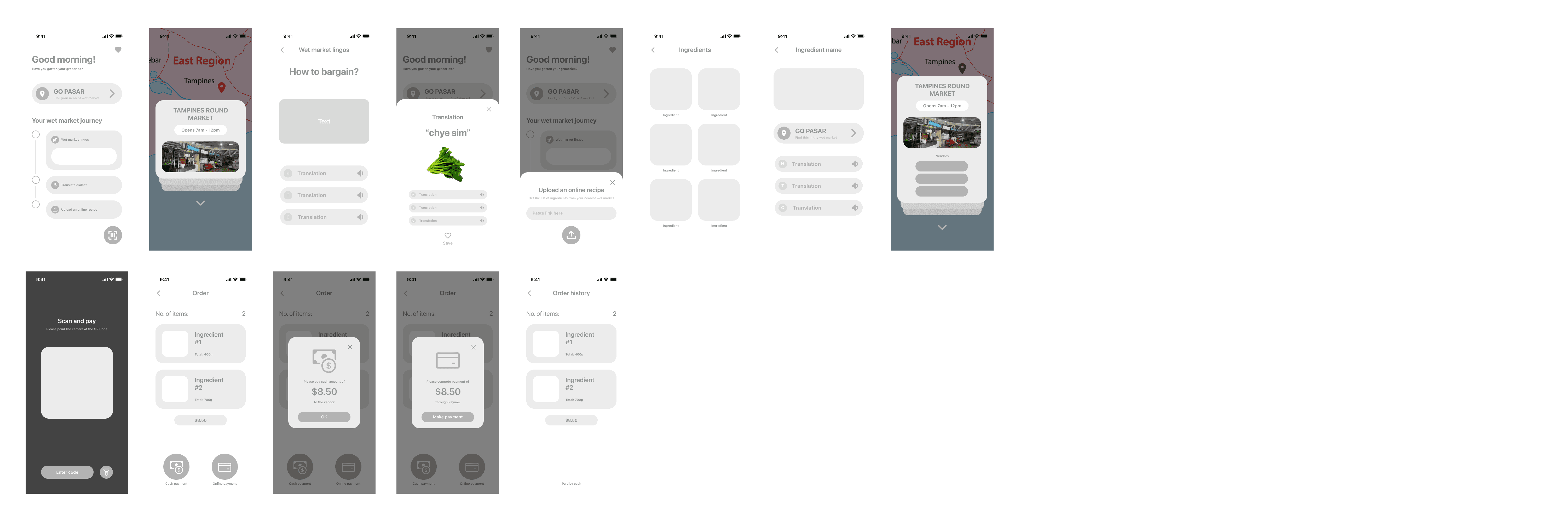
An app that consist of three stages: Learn, Interact & Transact, Engage.
LEARN
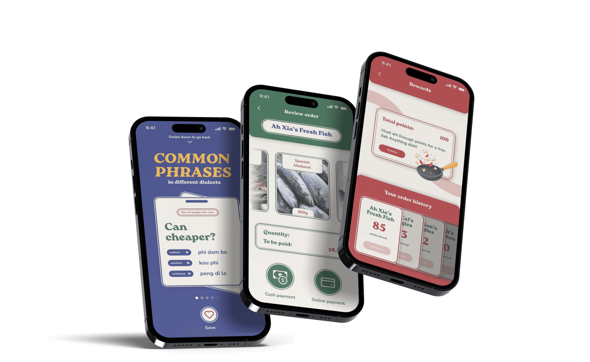
Feature commonly-used wet market lingos to aid users in communicating with the vendors effectively. Users can choose their preferred wet market to visit by uploading recipes onto the app or by browsing stall reviews.
INTERACT
&
TRANSACT
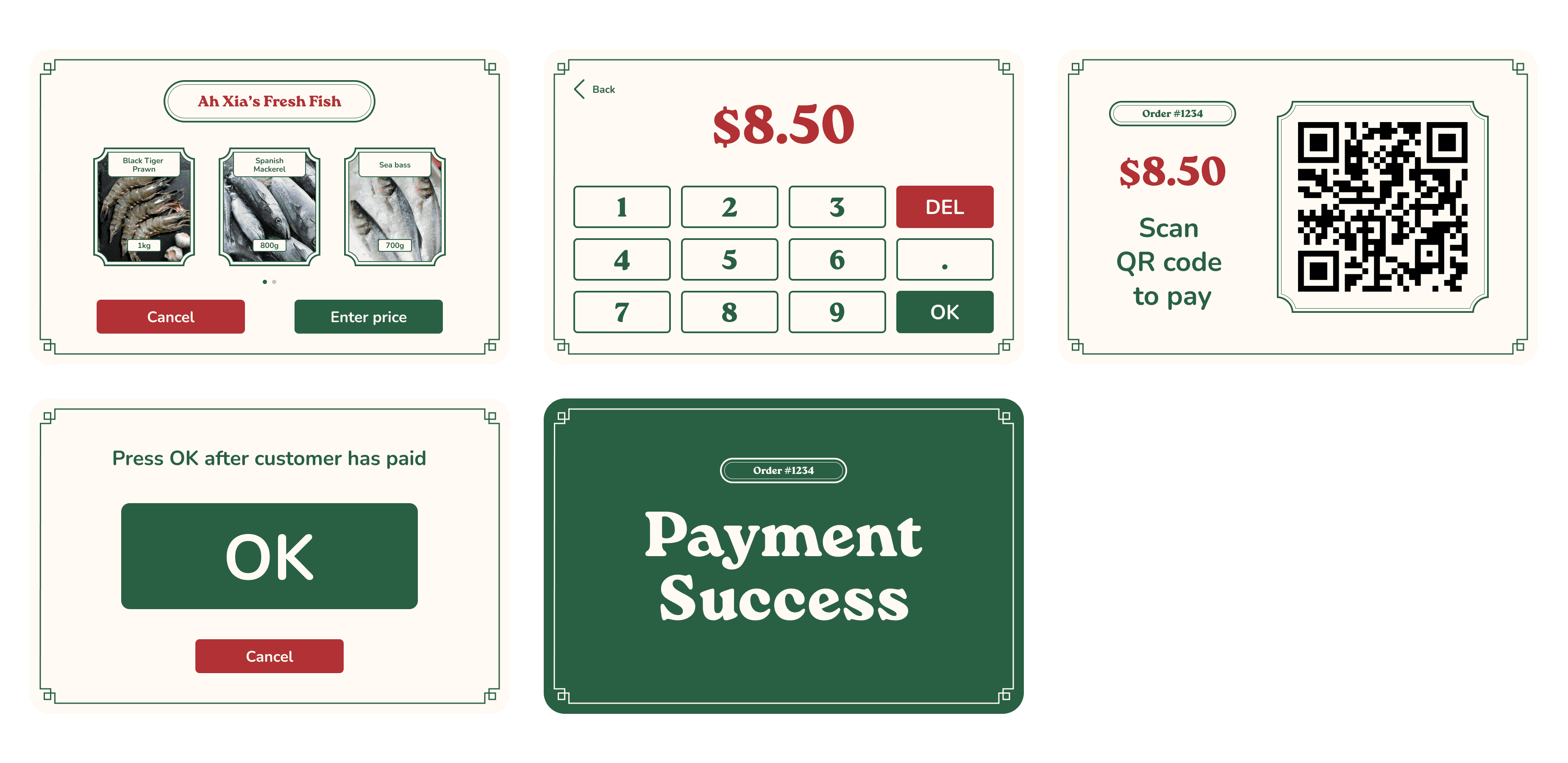
If users encounter unfamiliar phrases during their visit, they can get instant translation of various dialects using the app. It also allows users to review their order, and pay either via cash or PayNow. This streamlined process enhances transactions for both vendor and users, freeing time for interactions and a better experience overall.
ENGAGE
Users can view their order history and write reviews to earn points which can be redeemed at Jiak Anything (Pick N Cook service). By leaving reviews they would help others make more informed decisions when shopping at the wet market.
04
This study used a primary research method to collect data on the grocery shopping habits of younger generations and their impact on wet markets in Singapore. Surveys were conducted to obtain this data, and insights into market dynamics were gathered through site visits to wet markets across various neighbourhoods in Singapore and interviews with vendors.
We observed the diverse characteristics of wet markets across different locations through site visits. However, one thing that remains constant is the importance of human interaction during transactions.
These key insights provided an opportunity to revitalise wet markets by making them more appealing and accessible to young adults while preserving their cultural significance.
06
07
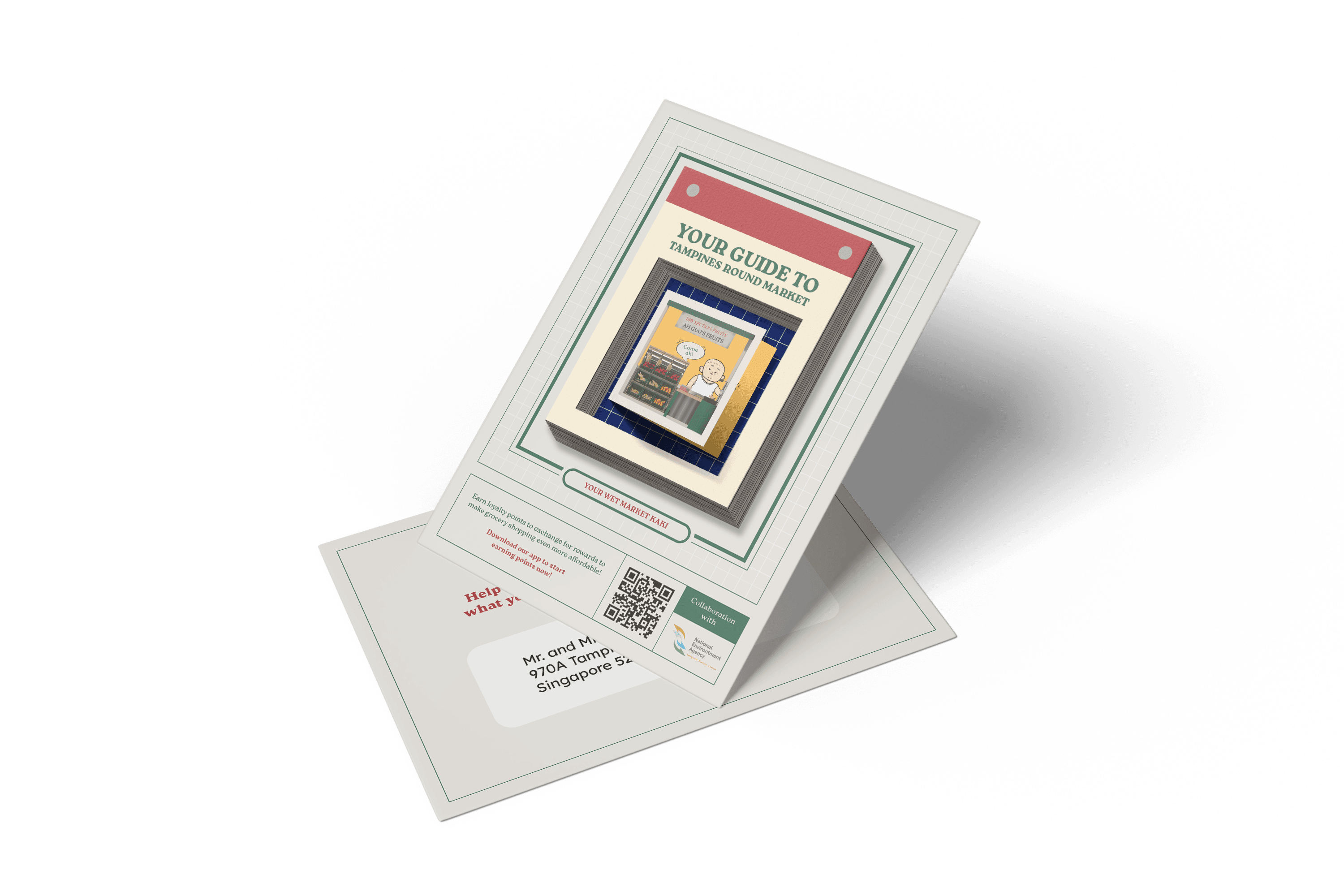
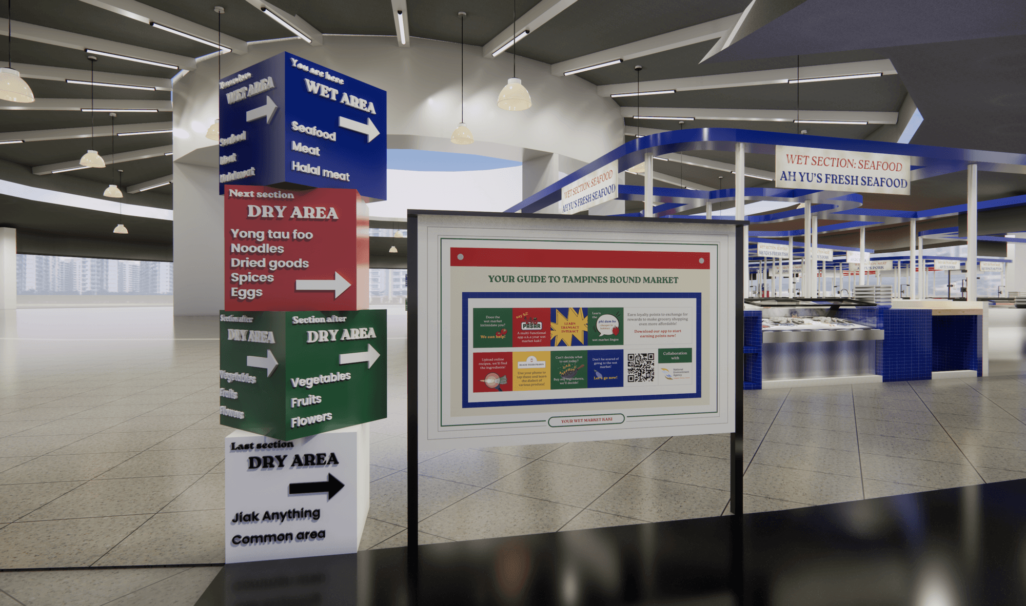
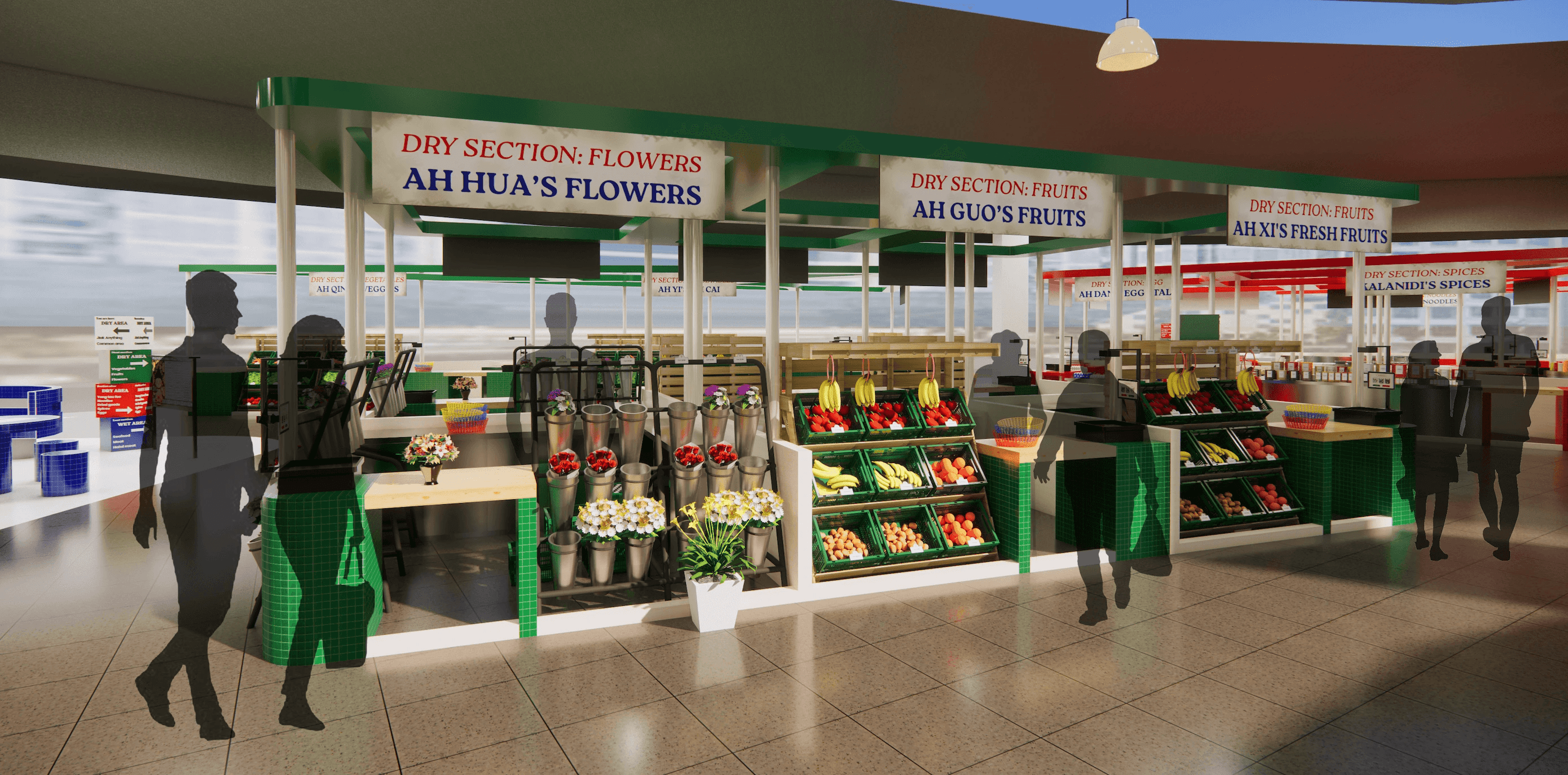
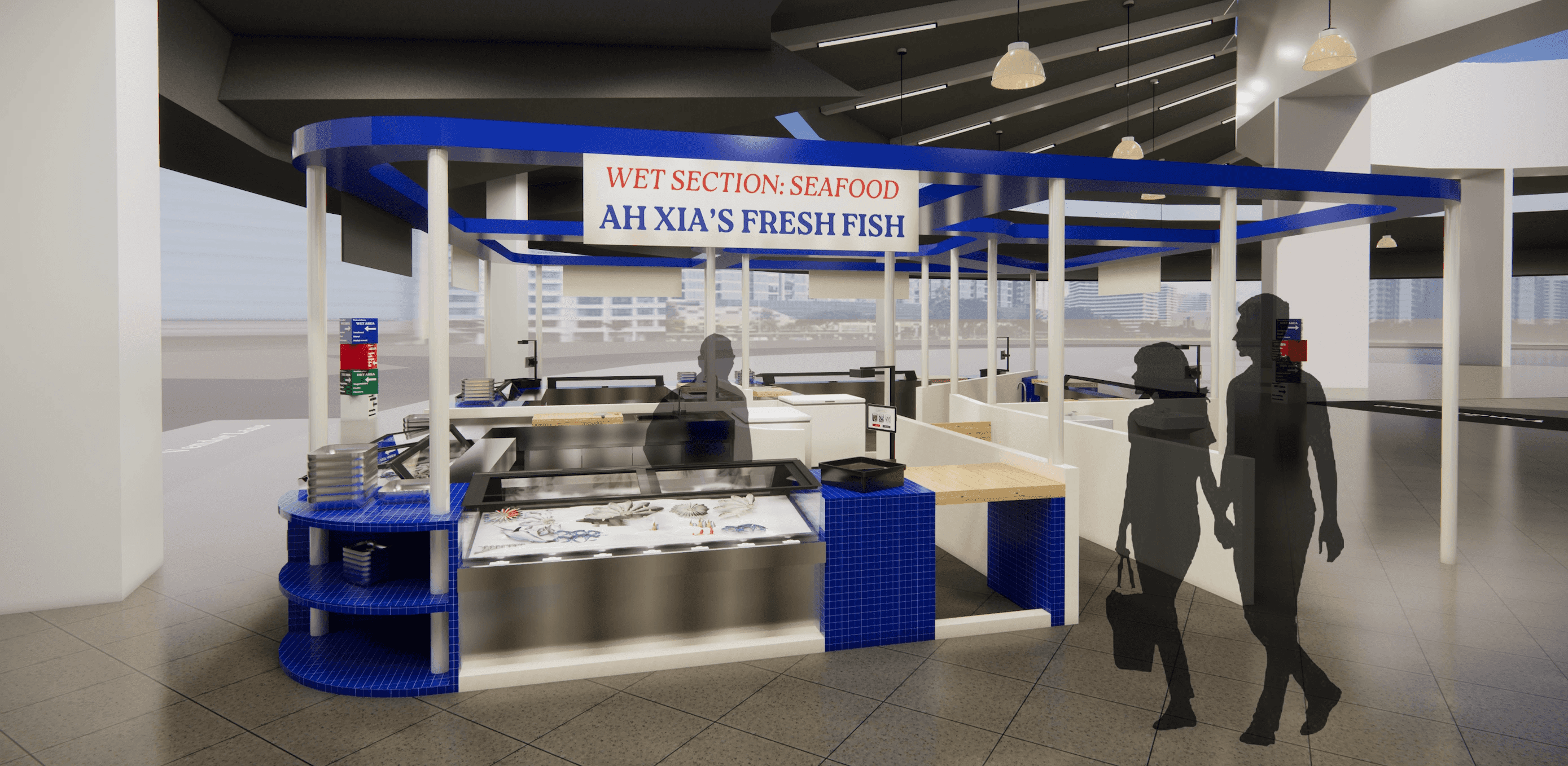
The goal is to reimagine the wet market experience, making it more appealing to the younger generation while preserving cultural spaces. Hence for the app's branding, I have embraced a vintage aesthetic reminiscent of Singapore in the 80s and 90s.
This nostalgic approach offers younger generations a unique blend of:
Cultural connection
Social interaction
Aesthetic appeal
08
09
REFLECTION
Exploring wet markets has given me valuable insights into their cultural significance, social dynamics, and the challenges they face. Through extensive research and analysis, I've gained a deeper understanding of how wet markets balance tradition and modernity. By adapting to contemporary needs while preserving their traditional essence, wet markets can continue to serve as vital social hubs for generations to come, bridging the future with the past.
Further refinement
This project extended beyond UI/UX design, so user testing was not conducted. It would be good to conduct one to understand user's needs and preferences. The app's flow and interactions could be refined with more time, particularly how the app responds to user actions. Future functionality improvements could include features like customised recommendations based on user preferences and past purchases.

